Sydney Street Dance Event Hub
A revamp of the Sydney street dance community calendar — started as a group effort, finished solo, with a little help from AI to translate the design to code and crack the automation problem I couldn't solve alone.
Where it started
The calendar existed — but it was held together by goodwill and group chats
Sydney's street dance community already had a shared Google Calendar, managed by a small group of volunteers who manually scavenged Facebook groups and Instagram posts to keep it updated. Anyone who wanted an event added had to track down someone with edit access and hope they saw the message in time.
The site it lived on was a Blogspot page with an embedded Google Calendar widget. Functional, but barely. It had been that way for years.
A group of us started talking about doing a proper overhaul. I ran user interviews to inform what that could look like. We had momentum for a while — then life got busy, the group lost steam, and the revamp quietly died.
The previous site — a Blogspot page with an embedded Google Calendar widget. Functional, but barely.
What the research told me
Newcomers didn't know the calendar existed at all
The interviews revealed a clear split. Established community members and event organisers knew about the calendar and relied on it. Newer dancers had no idea it existed — they were finding events (or missing them) through Instagram stories and Facebook posts like everyone else.
The core use cases were also clearer after talking to people. The calendar wasn't really about discovery — it was about coordination. Organisers needed to see what was already planned so they could avoid clashing with other events. Dancers needed to plan ahead and manage their schedules. Everyone was trying to avoid event fatigue — too many things on the same weekend, audiences split thin, energy spread too wide.
The calendar wasn't a discovery tool. It was a coordination tool for people who were already in the loop — and invisible to everyone else.
The visibility problem wasn't just about the calendar's design — it was about how events flowed into it in the first place. Manual curation from social media meant delays, gaps, and a single point of failure whenever the volunteers got busy. Fixing the interface without fixing the pipeline would just make a prettier broken system.
The approach
Group revamp shelved — so I built something smaller that actually worked
A full redesign was off the table. Hosting costs, no dev support, no group momentum. But I still had the Blogspot access and a clear picture of what needed to change from the research.
From my early Blogspot days I remembered a trick — using hidden div elements to fake navigation elements that the platform wouldn't normally support. If I could hand-code a custom template in Blogger, I could build almost any layout I wanted without paying for hosting.
So the question became: can I replace the embedded Google Calendar widget with something I build myself, and can I make the submission process self-maintaining so it doesn't depend on a volunteer team?
The answer was yes, yes I can. And yes I did, with the help with manus.im.
The automation problem
I knew automation was possible — I just didn't know how to do it. I tried an automation platform first but couldn't get it to do what I needed. Then I remembered building a basic Excel macro at a hackathon and thought: there has to be a Google equivalent. There was — Google Apps Script. I used Manus to work through both the Apps Script logic and the Blogspot template itself — iterating on the template while the site was live, running through versions until the event parsing worked correctly and the filters behaved the way they should.
That live iteration process was messier than I'd like to admit. There were versions where the calendar rendered wrong, filters returned nothing, or the parsing broke on certain event formats. Each one taught me something about where the logic was fragile. Manus helped me move faster through those cycles than I could have alone — but I was the one deciding what was broken and what good looked like.
The submission flow became: organiser fills in a Google Form → data lands in a Sheet → script processes it → frontend displays it. No manual steps, no volunteer bottleneck.
What I built
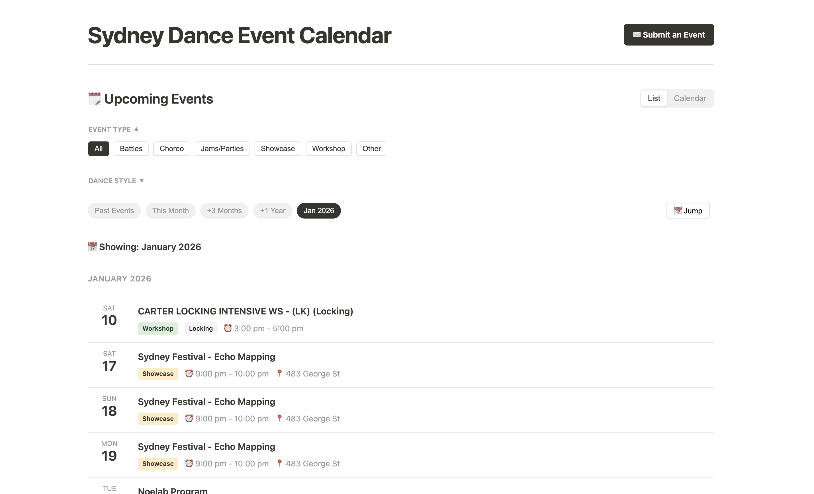
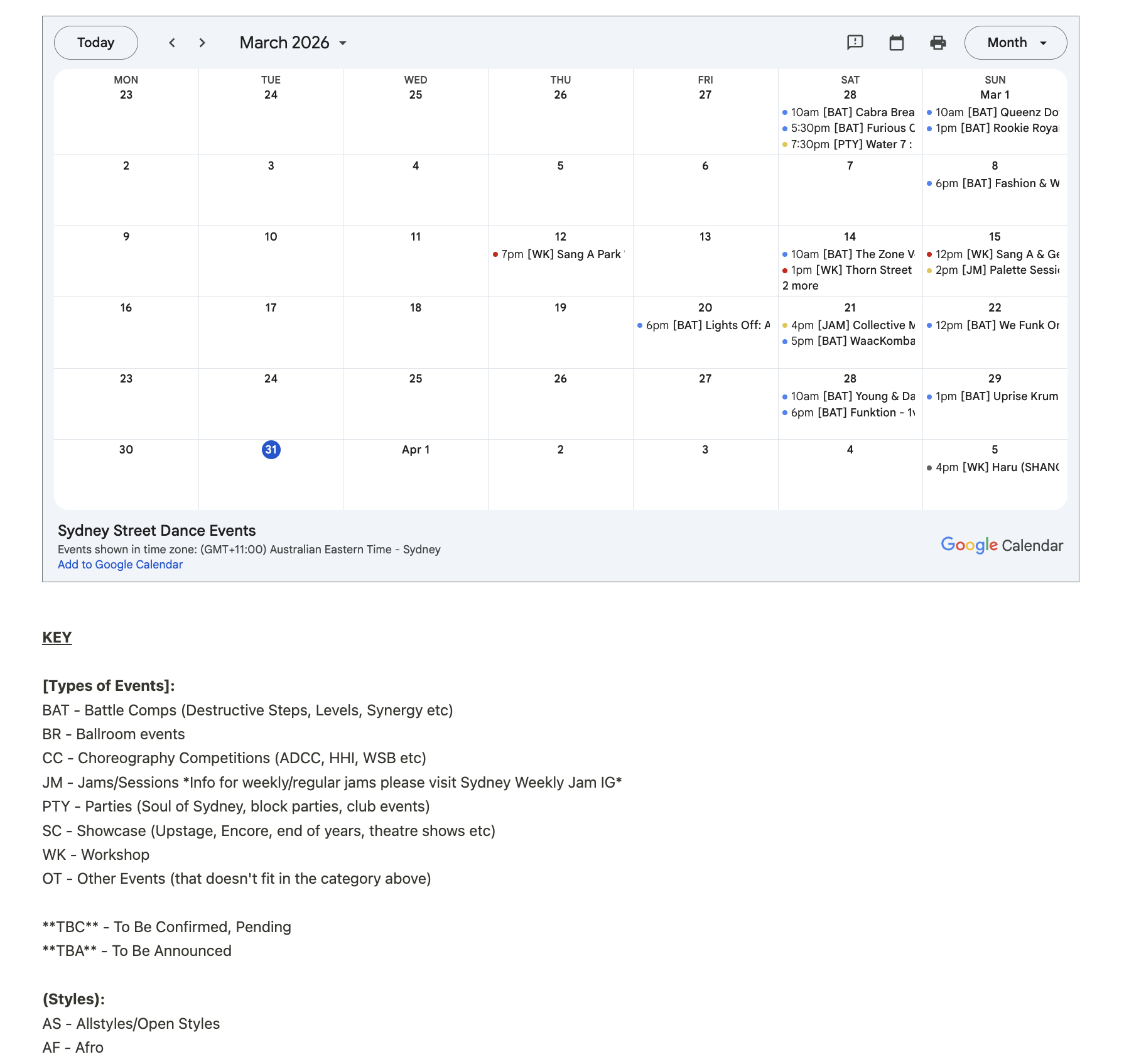
A list view, a calendar grid, and filters that actually reflect how dancers search
The frontend has two views — a chronological list and a monthly calendar grid — switchable by the user. Events are tagged by type (battles, workshops, social events) and dance style, with filter options that reflect how the community actually talks about events. Specificity tags like Rookie, Women Only, and Under 18 make niche events discoverable rather than buried.
The calendar grid was the hardest part of the frontend build — mapping event dates to the right grid positions, handling the edge cases, and keeping it readable on mobile. The list view came together quickly; the calendar took several evenings of trial and error.
Impact
80% increase in event submissions within the first two months
Within two months of launch, the number of community members actively submitting their events to the calendar increased by 80%. The self-service submission form removed the dependency on tracking down a volunteer — organisers could add their own events directly, which meant the calendar became more complete, more current, and more useful for the people checking it to plan their schedules.
Reflection
Shipping something imperfect beats a perfect plan that never ships
The group revamp would have been better designed. It also never would have launched. This version launched.
The research I did was genuinely useful — the newcomer visibility finding shaped the decision to make the site more discoverable rather than just prettier. But most of those insights are still sitting in a document waiting for a version 2 that may never come.
What I'm most glad about: I didn't wait for someone else to help. When I hit the automation wall, I found a way around it rather than stopping. Using Manus to work through the Apps Script logic felt like the right call — I understood enough to guide it and validate the output, even if I couldn't have written it from scratch.
If I were starting fresh, I'd fix the submission validation — the parsing logic is brittle if organisers fill in the form inconsistently. Constrained dropdowns at the form level would have been smarter than regex cleanup after the fact.