An educational support tool designed in 2.5 weeks — helping patients navigate fertility treatment alongside acupuncture and TCM, with confidence.
01 — Overview
This was a project sprint with Academy Xi, as part of their Transform UI/UX course. Sustain Health is an acupuncture and Traditional Chinese Medicine clinic in Melbourne, run by Dr. Scott Ling.
Dr. Scott came to us with the objective of streamlining the patient journey in fertility — providing patients with the support and education they needed when using acupuncture and TCM. Two constraints shaped our focus from the start:
Deliverables
Have a play with the prototype
200+ screen Figma prototype — onboarding form, educational journey map, and personalised dashboard.
02 — My Role
My team used the Double Diamond process. I led the research and discovery phase and contributed across define and delivery through:
"Hit the nail on the head, I feel listened to about the problems we had."
— Sustain Health client feedback03 — The Problem
With the client brief in mind, we developed a problem statement to guide our process.
Individuals partaking the fertility journey are stressed and confused about their experience with Traditional Chinese medicine and acupuncture as a complementary support — and struggle to find credible, personalised information.
04 — Process
The project kicked off with desktop research. Three data points anchored the problem space:
Australian couples of reproductive age experience fertility problems
Cases involve a problem in the women's reproductive system causing infertility
Female infertility can be affected by several conditions — making personalised support critical
This confirmed the problem space was real and that TCM and acupuncture represent invaluable complementary support for patients navigating it.
We conducted a SWOT analysis of direct competitors and parallel stream analysis of resource-based platforms to understand how to organise content across different user states — newly diagnosed, mid-journey, and post-treatment.
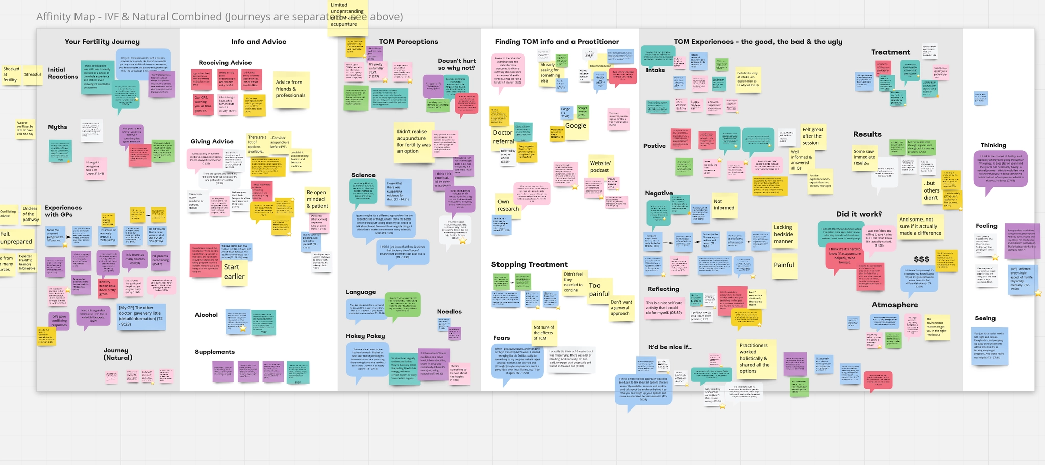
Affinity mapping across 11 interviews — synthesising patterns to surface the core insights that shaped the product.
04 — Process (continued)
Eleven interviews were conducted — a mix of practitioners (specialists in women's health and reproductive support) and patients, including those who had experienced pregnancy loss. A click survey captured additional quantitative signal.
57% said the information they found was not what they were actually looking for — it didn't match what they were feeling. They needed filters, categorisation, and support to understand what was relevant to them. Sustain Health needed to provide more clarity, not just more content.
80% had searched for alternative methods, primarily online. Patients were open to and actively seeking complementary medicine options — they just couldn't find trustworthy, personalised information.
71% of patients were only 'sometimes' satisfied with the fertility information they received from primary care. 38% actively sought complementary information to fill that gap — a clear opportunity for Sustain Health to step into.
22% found social media information drove a negative influence on their fertility journey. 57% were only sometimes satisfied with online advice quality — validating the need for a clinically grounded, trusted information source.
Interviews refined our understanding of the user significantly. In close collaboration with the client, we arrived at a final problem statement:
The Australian fertility journey is disorienting, unreliable, and lacks personalised support. Sustain Health can bridge this gap by making complex information relevant, accessible, and tailored to each patient's specific stage and circumstances.
After synthesis across the research, Alicia Saunders emerged as our primary persona — a 32-year-old mid-journey IVF patient, confused by the volume of online information and looking for a trusted source she could navigate on her own terms. She became the anchor for every subsequent design decision.
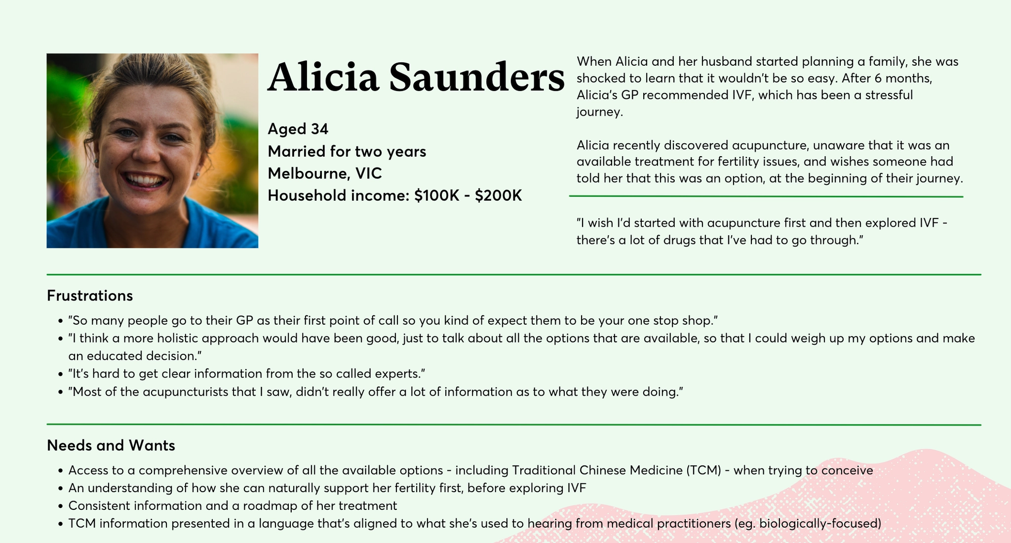
Alicia Saunders, primary persona — shaped every design and content decision across the product.
05 — Ideation & Design
With insights and a persona in hand, we ran How Might We sessions to generate design directions. The strongest themes: simplifying complex fertility information, building trust through personalisation, and reducing anxiety by creating a sense of structure and progress.
The workshop explored how Sustain Health's tools could address specific user conditions — and surfaced key design principles:
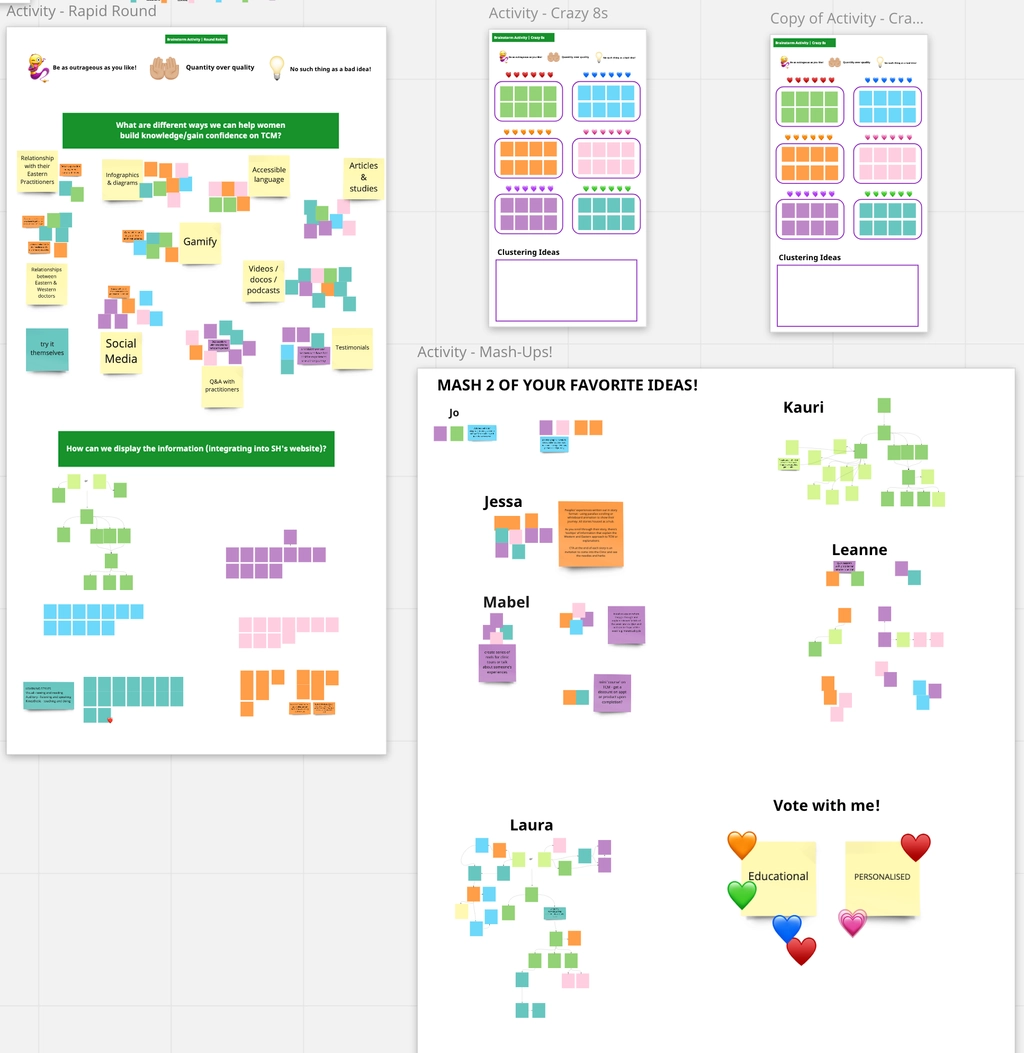
Ideation workshop — surfacing design directions from research insights.
05 — Design (continued)
We moved from whiteboarding and paper sketches to digital concepts — testing the onboarding flow, dashboard layout, and educational content modules before committing to Figma.
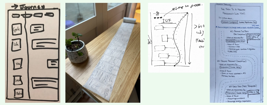
Early sketching — exploring directions before committing to digital wireframes.
To structure a complex product with multiple user pathways, we created an IA map informed by parallel stream analysis of resource-based platforms. The IA needed to work across three user states: newly diagnosed, mid-journey, and post-treatment.
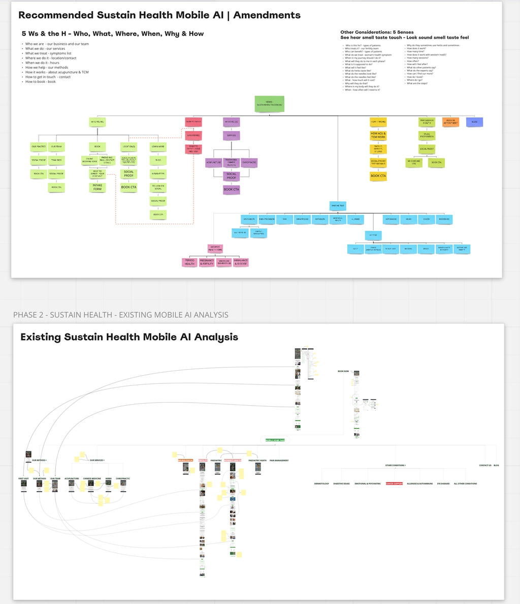
Information architecture — structured to work across newly diagnosed, mid-journey, and post-treatment user states.
Concepts were validated and iterated across a three-prototype cycle:
Paper prototypes tested the onboarding and personalisation concept before any digital build. A walkthrough approach was used in user testing, with the lead guiding a participant through the experience using paper frames.
Affirmative: basic onboarding and dashboard tasks completed successfully. Constructive: images and text for each step were too generic — users needed more personalised, stage-specific content.
Built across feedback rounds — incorporating personal progress tracking, milestone markers, and content modules tailored to each user's specific fertility context.
Content hierarchy and mobile navigation were tightened. Two of three mobile family page variants were found to be non-linear — consolidated into a single clearer flow before final delivery.
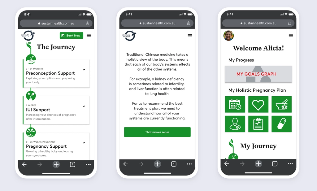
Mid-fi prototype screens — the final delivered Figma prototype reached hi-fi across 200+ screens.
06 — Retro
Team collaboration was excellent — process, project management, and communication ran smoothly across the sprint. Having clear swim lanes early meant we could move quickly without blockers.
The user testing cycle was highly effective. Defining the test plan before execution gave us structured, actionable findings — and meant the IA we landed on was genuinely informed by users rather than assumptions.
Async communication broke down mid-sprint — some team members weren't sure how the project had progressed. Better documentation cadence (even just a short daily async update) would have kept everyone aligned.
Given more time, I'd have extended scope to cover the practitioner-facing experience — how Dr. Scott and his team interact with patient data and progress. That side of the product had significant untapped potential.
The client was impressed enough to continue the engagement beyond the sprint — a signal that the research-grounded approach and rapid iteration cycle landed exactly where it needed to.